Saturday 31 March 2012

Hapa- zome Part 2 - another bash

There's  possibly only one thing better than pottering about on a warm spring day doing something creative in the garden and that would be sharing it with a like-minded friend.When I showed Sue the initial hapa-zome prints I made for my first post on this craft, she had said she would love to have a go at it. I had been waiting for the garden to produce some suitable flowers to start hammering again.  A couple of days ago with the gorgeous weather,  a growing abundance of blossom and blooms and Sue dropping around for coffee,  it was the perfect opportunity. Different season, different flowers and leaves to try. Here's a sampler of the things we tried.

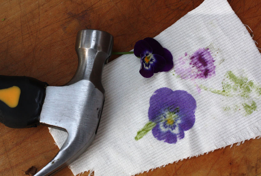
My hammering technique is a little rusty and not as thorough as it could have been but this is what we found.
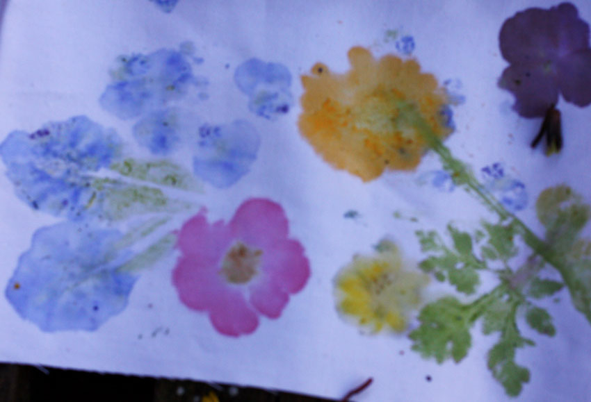
Clockwise from top left.
Muscari (grape hyacinth) - very sappy and it is best to strip the little bells from one side of the stem first and lay it with the stripped side uppermost before hammering. Although it doesn't produce a sharply defined outline the blue pigment transfers well and the little bells can be used individually to punctuate or infill other designs.
Forsythia - the colour was a surprise being very more mustard than the bright yellow of the flowers. The four petals made quite a stark cross but I felt they would be worth trying in a formal pattern with other smaller flowers in between.
Perennial wall flower - the flowers are a deep rusty red and produce a dark brown imprint with well defined edges.
Pineapple sage flowers - I love the bright lipstick red of these flowers and they printed as reddish-pink.
Scented Pelargonium flowers - A little bit disappointing but probably worth a more determined try.
Viola - this print shows how lack-lustre my hammering technique has become and somehow the fresh flower excused itself and disappearedfrom the edge of the board in the time between arranging this shot and picking up the camera - something I only noticed after I began reviewing my shots. Check below in this post to see how effective these flowers could be.
Chaenomeles (flowering quince) - very effective prints with good colours and definite edges.
Lesser Celandine -  The colour transfer was good but I was surprised at how blurry the edges were. We tried it again throughout the afternoon with similar results.
Kerria - This is such a messy tousled flower that I would have given it a miss for this technique but Sue tried it and found that it did imprint quite well, including the stem, buds and leaves.
Oxalis leaf - very effective imprints when thorough hammering applied.
Herb Robert leaf - good results, the leaves are such delicate pretty shapes. I think discarding the larger stems is a good idea as it tends to produce a coarser line which detracts from the delicacy of the leaf imprint.

Sue's first try
My first attempts had been made using a length of unbleached calico and I wanted to see how other fabrics would work. A quick trawl through my fabric stash and I found some scraps of poplin and corduroy both of which had been bought so long ago that I could only hazard a guess at their fibre content. I felt they would probably have a high percentage of cotton and so would take the flower pigments reasonably well. The sampler at the top of this post and Sue's first try show how well the poplin worked. Being a finer weave it showed the shapes clearly and being a brighter white the colours were clearer.
As for corduroy - with a viola and methodical hammering, what an effective result!
Viola on corduroy
And Sue showed me with her second try that instead of haphazardly hammering any flower anywhere on the cloth, it might be better to think about an overall arrangement.


Thursday 22 March 2012

Splashes of gold

We seem to be in the  days of the year when the colour for unfurling petals to be is yellow. The colour seems to dominate every where from the ground up.
The lacquered gold of celandines, creeping in to any corner they haven't been chased out of. I know there are gardeners who deem them to be weeds but they pop up, have their cheery say for a few weeks of otherwise fairly quiet time and  then disappear. I can live with that.

The primroses appear in the garden with more intention on my part. I love this variety Emily, with the pastel yellow of the wild primroses and a splash of deeper gold in the centre. The wild ones are beautiful and quite a common sight on the roadsides and under the hedgerows around here. As yet though, they haven't tried to call our garden home. They would be very welcome.

At the moment, you can't drive very far along the roads without encountering roadside daffodils either in solitary ones or in mass plantings.

And of course, no spring roll call of yellow flowers would be complete without  forsythia.  In some circles it is considered a vulgar shrub and there are gardeners who wouldn't give it ground space.  I can see that clipped into hedges the flowers are dense and intense, brash and brazen. Left to its own natural tendencies it is a much prettier thing; delicate sprinkles of yellow set off well against either a  blue or a grey sky.